
|
|
|
|||||||
| BASKETBALL Post your Basketball Cards Hobby Talk |
 |
|
|
Thread Tools | Display Modes |
 07-21-2023, 06:16 AM
|
#1 |
|
Member

Join Date: Feb 2021
Posts: 6,492
|
The fourth of the "Hobby Rushmore" players after MJ, Bron, and Kobe. (see also the Bill Russell edition)
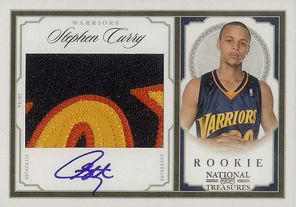
Going through the tcdb, here were some Major Release issues that caught my eye (and there are exactly 30 of them, same as his jersey number): 2009-10 Bowman 48 #106 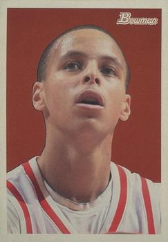 2009-10 Panini Court Kings #129 auto /649 (in my top 5 favorites here) 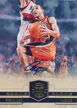 2010-11 Panini Absolute Memorabilia #10 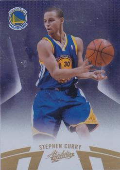 2010-11 Panini Rookies & Stars Longevity #86  2011-12 Panini Gold Standard #87 /299 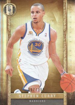 (golden state, get it?) 2012-13 Panini #155 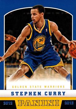 2012-13 Panini Absolute #36 (in my top 5 here) 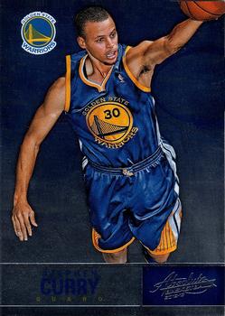 2012-13 Panini Brilliance #72 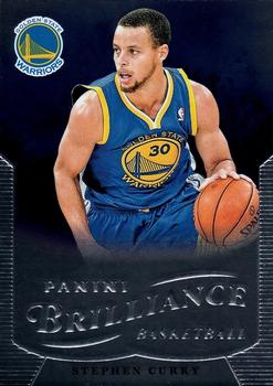 2012-13 Panini Gold Standard #27 /349 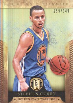 2012-13 Panini Intrigue #52  (image source, the only good one I found) 2012-13 Panini Marquee #33  (the colors clash some, but still) 2013-14 Panini Gold Standard #81 /199  2013-14 Panini Intrigue #98 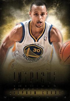 2013-14 Panini Totally Certified #16 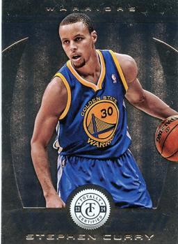 2014-15 Panini Court Kings #66 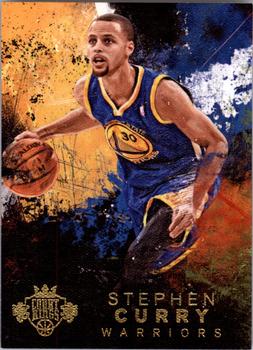 2015-16 Panini Noir #10 /99 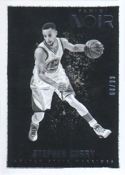 2015-16 Panini Prestige #124 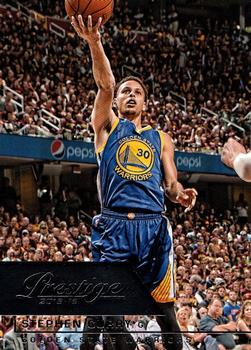 (reminds me of that 98 UD MJ, just make statues from 'em) 2015-16 Panini Prizm #170  2015-16 Panini Select #99 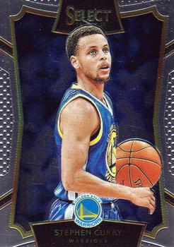 2016-17 Panini Select #88 (the best of the bunch?) 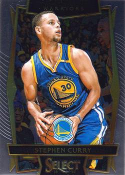 2018-19 Donruss Optic #2 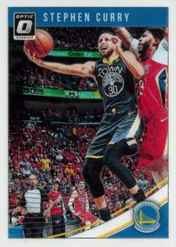 2018-19 Panini Court Kings #37 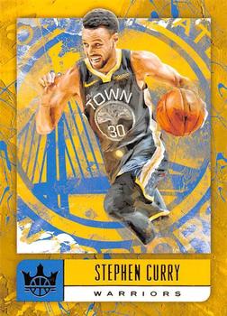 2018-19 Panini Select #205 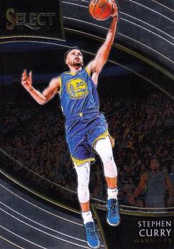 2018-19 Panini Threads #214 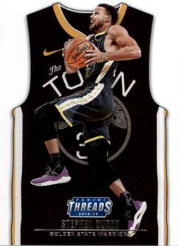  2019-20 Donruss Elite #30 (or is this the best of the bunch?) 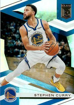 2019-20 Panini Origins #5 (or is it this one?) 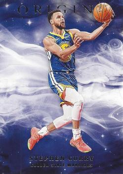 2019-20 Panini Spectra #99 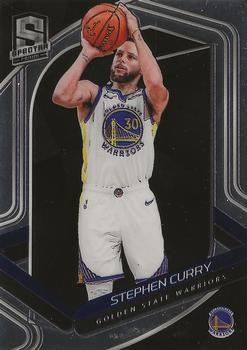 2021-22 Donruss Elite #131  2021-22 Panini Black #36 /149 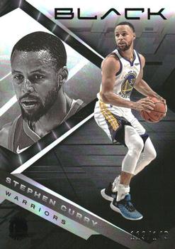 2021-22 Panini Illusions #104 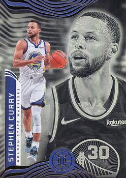 So if I had to rank them I think it'd be a 3-way tie for First between the '16 Select, '19 Elite and '19 Origins, then the Court Kings RC and '12 Absolute, then '12 Panini and '13 Certified, then '09 Bowman, '12 Brilliance, '15 Noir, '15 Prizm, '15 Select, '18 Optic, '19 Spectra, '21 Black, '21 Elite, '10 Longevity, '13 Gold Standard, '18 Select, '12 Marquee, then the rest |

|

|
|
07-21-2023, 08:08 AM
|
#2 |
|
Member
Join Date: Nov 2022
Posts: 255
|
So no NT RPA, no 2012 Prizm Gold, no Contenders Rookie Ticket, etc.? Beauty is in the eye of the beholder I guess but thats a tough list on my eyes. The Bowman 48 rookie is kinda ugly imo. That one in particular would never jump out at me.
|
|
|
|
|
07-21-2023, 08:29 AM
|
#3 | |
|
Member
Join Date: Feb 2021
Posts: 6,492
|
Quote:
|
|
|
|
|
|
07-21-2023, 02:05 PM
|
#4 | |
|
Member

Join Date: Jun 2022
Location: Toronto
Posts: 670
|
Quote:
 When this card came out, I was too focused on Brandon Jennings! Too bad! 
|
|
|
|
|
|
07-21-2023, 06:27 PM
|
#5 | |
|
Member

Join Date: Sep 2020
Location: Long Beach, CA
Posts: 918
|
Quote:
|
|
|
|
|
|
07-21-2023, 06:34 PM
|
#6 |
|
Member
Join Date: Sep 2020
Location: Long Beach, CA
Posts: 918
|
I'll put forward 3 other cards.
The first two are Court Kings 5x7 Panoramics from '14-15 & '15-16. These inserts, with the designs of these particular years, might be the most beautiful cards I've ever seen:   And then one more from the set that's been the king of basketball photography in the Panini era: Hoops. This is '15-16, one of the most basic designs, but also a year where they really put effort into picking cool photographs. Probably the best base set photography since '08-09 Topps. 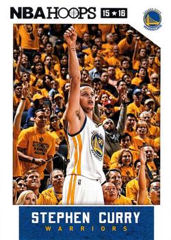
|
|
|
|
|
07-21-2023, 06:50 PM
|
#7 | |
|
Member
Join Date: Sep 2020
Location: Long Beach, CA
Posts: 918
|
Quote:
I wanted to speak to the Bowman card because I can understand why it would seem ugly to others, and I particularly like your express "jump out" because to me that's the most honest aesthetics. If a card does slap you across the face when you see it, then it's missing something. So things I see here: 1. This is the face of the man who would revolutionize shooting by being way better at it than any human was ever supposed to be, and here we see him concentrating to this purpose. It's like being able to stare into the face of Einstein right before he has a brilliant epiphany. 2. It's him when he's young. He looks like a boy. He certainly doesn't look like someone about to knock the NBA on its ass. 3. This is a re-imagining of the 1948 Bowman set - the original basketball set. There's history there being linked to, and there's a particular aspect that was special about the Bowman set: Absolute minimalism without even the player's name to get in the way of the image. To be clear, this isn't necessarily a pro in the 1948 set even back then because basketball was such a minor sport. There's no way that it made sense to assume that people back then knew who all of these players were...but when you do know who the player is, that lack of name makes it mark of an artistic piece. More iconic. 4. The coloring in the original Bowman set doesn't actually feel minimalistic so much as primitive. Clearly they didn't use less colors because they were artists, but because it was easier and cheaper. Further the colors they used do tend to feel like forced fits. But for the 2009 set, it feels elegantly minimalistic. They also wisely don't just use the same exact hue as in the original set. They use red & blue backgrounds before, but this red feels worn as if its old without feeling literally faded. The contrast is not lost, but the nostalgia vibe are strong. 5. The color match with Curry's college uniform is fantastic. If you didn't know better you'd think they chose that specific red to match Curry - they certainly made the choice to use the red rather than the blue with Curry, but Curry wasn't prominent enough to justify adjusting the entire set around his uniform colors. 6. Finally with the entire Bowman set, the sense of it as a bookend is potent. Basketball card sets began in 1948 with Bowman, and the Topps era of basketball was taking its bow with this set. They didn't fancy it up with all sorts of chrome. It's just pure. As someone who is very critical of their 00s Bowman designs with their evil-empire black & red, this set is like a breath of fresh air. When I decided to get back into collecting in 2020 (yeah, I'm one of those), and started using tcdb to figure out what had gone since I left in the '90s, this was THE card that jumped out to me. |
|
|
|
|
|
07-21-2023, 06:53 PM
|
#8 | |
|
Member
Join Date: Sep 2020
Location: Long Beach, CA
Posts: 918
|
Quote:
The '21-22 design on the other hand really pops to me: 
|
|
|
|
|
|
07-21-2023, 08:18 PM
|
#10 |
|
Member
Join Date: Jan 2013
Posts: 554
|
this one for me
 , on Flickr , on Flickr
|
|
|
|
|
07-21-2023, 08:32 PM
|
#11 | |
|
Member
Join Date: Feb 2021
Posts: 6,492
|
Quote:
)
|
|
|
|
|
|
07-21-2023, 08:33 PM
|
#12 |
|
Member
Join Date: Feb 2021
Posts: 6,492
|
with the auto'd cards, would the fans/owners of them think highly of their aesthetics without the auto, or does the auto figure into the aesthetics for them?
|
|
|
|
|
07-21-2023, 09:06 PM
|
#13 |
|
Member

Join Date: Jun 2012
Posts: 11,208
|
Ill never like the 09-10 Bowman. His Topps/Chrome Rookie looks much better and I also dislike that one.
The base was already posted, this one is a great color match.  2015-16 Panini NBA Hoops - [Base] - Blue #248 - Stephen Curry /399 [I]Courtesy of COMC.com
__________________
B.I.D. |
|
|
|
|
07-21-2023, 09:25 PM
|
#14 |
|
Member
|

|
|
|
|
|
07-21-2023, 09:27 PM
|
#15 |
|
Member
Join Date: Dec 2020
Posts: 488
|
it's NT RPA, it's not even close
|
|
|
|
|
07-22-2023, 12:17 AM
|
#16 | |
|
Member
Join Date: Feb 2021
Posts: 6,492
|
Quote:
Sent from my V350C using Tapatalk |
|
|
|
|
|
07-22-2023, 01:11 AM
|
#17 | |
|
Member
Join Date: Sep 2020
Location: Long Beach, CA
Posts: 918
|
Quote:
 For me in general it's easy for memorabilia to gum up the works in the aesthetic of a card. I don't want to really point to examples of cards I don't like, but let me give some shout outs: First, I already gave my thumbs up to the Curry Court Kings RC. Sticker autos are often a major negative for me relative to hand-siqned cards, but it's not a general principle thing, it's just that if my eyes focus on the sticker being a sticker, that's not good. The Court Kings card works because the sticker mostly blends in. In terms of the actual auto, I appreciate the space being used here to allow Curry to really do his signature well.  Beyond that, the gold Noir autos come to mind as beautiful:  The autograph itself really pops without compromising the image. |
|
|
|
|
|
07-22-2023, 07:23 AM
|
#18 | ||
|
Member
Join Date: Nov 2022
Posts: 255
|
Quote:
Quote:
|
||
|
|
|
|
07-22-2023, 06:15 PM
|
#19 | |
|
Member
Join Date: Sep 2020
Location: Long Beach, CA
Posts: 918
|
Quote:
In terms of the Topps card, I'm considerably less impressed, but I don't want to focus on the negative. What I'll say is that Topps in that last year had lost their license which impacted what they could do with the rookies. With the Bowman card, they did what I described. For the Topps card, they seem to have just found a picture of Curry smiling. Not the worst thing they could have done as it clearly appeals to some, but there's nothing that says "basketball" about the image except the logo on Curry's t-shirt, and seeing a basketball player in a t-shirt doesn't do much for me. |
|
|
|
|
|
07-22-2023, 08:17 PM
|
#20 |
|
Member

Join Date: Jun 2020
Posts: 3,923
|
2020-21 Elite is one of the worst lol not feeling that choice
The Timeless Moments with the jerseys on the floor is cool The championship ‘goodnight’ hands auto from whatever set it came out in 2019-20 Select Concourse White Prizm (also the same photo as the 2020-21 Prizm) is a good one I like the 2020-21 Courtside silver way better than the 2018-19 There’s too many, and at the end of the day its subjective but my nominee for a cheap card that just looks super dope is this 2022-23 Hoops /199 Holo:  Sent from my iPhone using Tapatalk Last edited by PSA2Pac; 07-22-2023 at 08:20 PM. |
|
|
|
|
07-22-2023, 11:35 PM
|
#21 |
|
Member
Join Date: Jan 2008
Posts: 525
|
Here are 3 of my favorite cheap and easily found Curry's:
Full Bleed:  2013-14 NBA Hoops - Courtside #12 - Stephen Curry Courtesy of COMC.com Retro Themed:  2018-19 Panini Donruss Optic - Winner Stays - Purple #15 - Stephen Curry Courtesy of COMC.com Base card with a cool action photo:  2012-13 NBA Hoops - [Base] #180 - Stephen Curry Courtesy of COMC.com And a random insert that looks way better in hand than scans:  2013-14 Panini Pinnacle - Clear Vision - 1st Quarter #48 - Stephen Curry Courtesy of COMC.com |
|
|
|
|
07-23-2023, 12:42 AM
|
#22 | |
|
Member
Join Date: Sep 2020
Location: Long Beach, CA
Posts: 918
|
Quote:
Hell yeah! I'm a big fan of the Hoops Courtsides - especially in the years where they don't clutter them up too much |
|
|
|
|
|
07-24-2023, 01:12 AM
|
#23 |
|
Member

Join Date: Feb 2020
Posts: 248
|
One of my recent favorites. 2021-22 Elite Blue /99 -- sorry for the additional Klay. I PC both.

__________________
PC: Penny, Steph, Klay, and Kuminga Instagram: @1centcards, @splashbroscollector |
|
|
|
|
07-24-2023, 10:27 AM
|
#24 |
|
Member
Join Date: Mar 2021
Posts: 584
|

|
|
|
|
|
07-24-2023, 10:53 AM
|
#25 |
|
Member
Join Date: Feb 2009
Location: Seattle, WA
Posts: 17,871
|
His "Stained Glass" card from this year is terrific.
Panini's inserts are generally very well designed, so Steph has tons of good-looking cards... |
|
|
|
|
| Bookmarks |
|
|


 Linear Mode

