
|
|
|
|||||||
| HOCKEY Post your Hockey Cards Hobby Talk |
 |
|
|
Thread Tools | Display Modes |
 10-23-2016, 01:01 PM
|
#1 |
|
Member

|
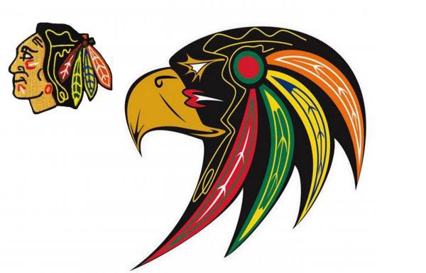
check this out ...
 First Nations Designer recreated this ...  Culturally Appropriate Chicago Blackhawks Logo by First Nations Artist Goes Viral - ICTMN.com
__________________
Go Leafs! Go Jays! Go Raps! Go Bills!
|

|

|
|
10-23-2016, 04:31 PM
|
#2 |
|
Member
|
... well typical for this forum zero feedback ... I was hoping for someone else's opinion on such an iconic logo ... and actually looks better and has more meaning direct from a First Nation designer
__________________
Go Leafs! Go Jays! Go Raps! Go Bills!
|
|
|
|
|
10-23-2016, 05:59 PM
|
#3 | |
|
Member
Join Date: Jul 2016
Posts: 2,033
|
Quote:
I prefer the original much more. Last edited by CoolG; 10-23-2016 at 06:01 PM. |
|
|
|
|
|
10-23-2016, 06:15 PM
|
#4 |
|
Member

|
That is hideous and I would hope it's just a joke, I don't think I would even want to see it used by a Minor League team!
__________________
So if I am going to be a hater who hates the Patriots then buddy I am going to be the best damn hater I can be. I AM ALL IN. |
|
|
|
|
10-23-2016, 09:53 PM
|
#5 |
|
Member
|
I think it is amazing ... the design came from a First Nations Designer ... the new version says more about their culture than the original ... the hawk rather than a person ... NO it isn't a joke ... my only criticism is that it may be too landscape ... maybe squeezed horizontally a bit ... still cool looking in my eye
__________________
Go Leafs! Go Jays! Go Raps! Go Bills!
|
|
|
|
|
10-23-2016, 10:09 PM
|
#6 | |
|
Member

Join Date: Sep 2011
Location: Ridgeway, ON
Posts: 2,998
|
Quote:
|
|
|
|
|
|
10-23-2016, 10:14 PM
|
#7 | |
|
Member
|
Quote:
__________________
Go Leafs! Go Jays! Go Raps! Go Bills!
|
|
|
|
|
|
10-24-2016, 12:07 AM
|
#8 |
|
Member

Join Date: Dec 2008
Location: In the Woods, Central NY
Posts: 36,059
|
Why would a hawk have multicolored feathers adorning its head?
__________________
I am going signature-free |
|
|
|
|
10-24-2016, 07:48 AM
|
#10 | |
|
Member

|
Quote:
__________________
I have found that flicking through a few threads on my smartphone is a great way to pass some time while "stocking the pond."Hairy 6/7/12 I feel you, brother. Welcome to East Berlin, circa 1963. Hairy 5/9/20 |
|

|
|
|
10-24-2016, 07:54 AM
|
#11 | |
|
Member
|
Quote:
|
|
|
|
|
|
10-24-2016, 07:59 AM
|
#12 | |
|
Member

|
Quote:
__________________
Most people would rather be in the majority, than be right. |
|
|
|
|
|
10-24-2016, 08:23 AM
|
#13 |
|
Member

|
I think the translation from the human to hawk head is nicely done. The retention of all of the colors and general placement of the colors is clever as well.
The problem with it as a multi-use logo is too many fine details and sharp edges. The original logo looks good in that tiny picture, and when you blow it up to a large patch on the front of a jersey, it still looks good. It doesn't look it, but the yellow line-work in the hair and the lines in the feathers are rather thick and chunky. It scales well. On the hawk-head logo, those same lines are very thin and will get lost in various applications. Stretching the feathers was a bad design move. If the new logo wasn't sitting next to the old one for reference and using those very specific colors, it would look like a cheap flash design you see on the wall of a tattoo parlor. |
|
|
|
|
10-24-2016, 09:42 AM
|
#14 |
|
Banned
|
We all have a spirit animal inside us.
|
|
|
|
|
10-24-2016, 11:59 AM
|
#15 | |
|
Member
|
Quote:
|
|
|
|
|
|
10-25-2016, 02:23 PM
|
#16 | |
|
Member
|
Quote:
 ... Can't wait for K-13's comment ... ... Can't wait for K-13's comment ...
__________________
Go Leafs! Go Jays! Go Raps! Go Bills!
|
|
|
|
|
|
10-25-2016, 05:57 PM
|
#17 | |
|
Member
|
Quote:
 Enough with this hyper sensitive #@#@#@#@ the Blackhawks logo is iconic and should never be altered!! There were enough nut jobs up there in Toronto who were attempting to have the Cleveland Indians logo banned for the ALCS which was just plain foolish!
__________________
So if I am going to be a hater who hates the Patriots then buddy I am going to be the best damn hater I can be. I AM ALL IN. Last edited by TASS; 10-25-2016 at 06:01 PM. |
|
|
|
|
|
10-26-2016, 02:55 AM
|
#18 | |
|
Member

|
Quote:
__________________
Got Tyler Ennis? |
|
|
|
|
|
10-26-2016, 09:19 AM
|
#19 |
|
Member
Join Date: Sep 2009
Posts: 504
|
One of the most, if not THE most, iconic logos in all of sports does not need to be changed completely.
I could see it on hats or shirts, but never as a true logo for the team. |
|
|
|
|
10-26-2016, 10:01 AM
|
#20 | |
|
Member
|
Quote:
Just make all teams a City only....
__________________
Texans Future Super Bowl Champions |
|
|
|
|
|
10-26-2016, 12:49 PM
|
#21 | |
|
Member
|
Quote:
__________________
So if I am going to be a hater who hates the Patriots then buddy I am going to be the best damn hater I can be. I AM ALL IN. |
|
|
|
|
|
| Bookmarks |
|
|


 Linear Mode

