
|
|
|
|||||||
| BASKETBALL Post your Basketball Cards Hobby Talk |
 |
|
|
Thread Tools | Display Modes |
 02-28-2021, 04:13 PM
|
#1 |
|
Member

Join Date: Sep 2020
Location: Long Beach, CA
Posts: 918
|
I'd like to get insight into how y'all, the Blowout-inati, see the basketball card brands of now and the past.
No rules on this in terms of how you slice and dice. If you want to talk about an appreciation that goes up to the company level, or down to one particular set - main or otherwise - go right ahead. I'm just interested in what resonates with you, and why. And I'd say pics are encouraged. Would make it more fun and enjoyable, I'd think. One more thing: I'd like this to stay positive, but I'm also interested in contrast between seemingly similar products. If you love Prizm and are meh on Select, or vice versa, what is it that makes you love that one thing? Revolution-heads, I'd love to see some cool thoughts too! I'll also give a shout out to the high end. If you strongly prefer NT or Impeccable or whatever, compared to other stuff made with no expense spared, what gives your fave the edge? Cheers, Tallboy |

|

|
|
02-28-2021, 08:01 PM
|
#2 |
|
Member

|
Cool thread.
I like holograms man. I still remember the first time I opened a pack of 1997 SPx. I was around 12 yo. and it was the first time my parents brought me and my brother to what later became "Mecca" for me. A card shop that was at a distance of 100 miles from where we lived, but we traveled there every couple of months. Unfortunately it closed a long time ago. The Gold Kevin Johnson I pulled form the single pack that my parents bought me for an unimaginably high price at the time ($3.50) blew my mind. My collection was only a couple of Metal cards, Collector's Choice and Fleer back then, so you can imagine why. I have been fascinated with holograms ever since and it even got me interested in the Holographic principle and other wonders of quantum physics. I also busted so many packs of 97 SPx and 97-98 SPx that I almost had a full base set. Now I collect the Holoview Heroes and Hardcourt Holoview inserts. Apart from the Kobe and Shaq cards of course.    ...and this was the card that brought me back into the hobby in 2012 after a 5 year break. 1996-97 SP Premium Collection (Holoviews). I coveted it ever since I saw a picture of it in a Beckett, and when I became an adult, I was like... Hey, why don't I finally add this one card to my collection. Then one became two and before I realized I was back in the game.  ...and now I side PC the whole set. 
__________________
People speaking on my verses, they don't know me, in fact. Me and these whack rappers get along like Kobe and Shaq. "K-Rino" |

|
|
|
02-28-2021, 08:11 PM
|
#3 |
|
Member

|
I’ve always been partial to fleer/skybox stuff from the late 90s. Love all of it. Football and basketball are both outstanding. My favorite parallel set(s) of all would probably be a tie between the original 1997 essential credentials or skybox star rubies.
Edit: there’s just so many great insert and parallel sets from throughout the years, that it is really hard for me to choose but those I mentioned always stand out to me. Last edited by packerfan4200; 02-28-2021 at 08:16 PM. |
|
|
|
|
02-28-2021, 09:28 PM
|
#4 |
|
Member
Join Date: Jun 2012
Posts: 3,207
|
Exquisite. When it came out I just kept thinking... my god, there has never been a product anywhere near this nice or special. And while I really love several Panini brands, nothing has ever come close to Exquisite since its final NBA-licensed run in 2009-10.
|
|
|
|
|
02-28-2021, 09:32 PM
|
#5 |
|
Member
Join Date: Jan 2011
Posts: 2,480
|
Exquisite, Ultimate, UD Black, Chronology. You already know why.
__________________
My LAKERS Patch Collection. IG: Lakers_Exquisite http://photobucket.com/Lakerspatchcollection |
|
|
|
|
02-28-2021, 09:55 PM
|
#6 |
|
Member
Join Date: Nov 2011
Posts: 659
|
Anything with that Stadium Club Matrix Tech.
1994-95 Rising Stars 1994-95 Team of the Future 1995-96 Warp Speed 1996-97 Matrix parallel People can say they are just cardboard, but there are many great cards, especially in the 90’s, that are more like pieces of art. The way they manipulate light and shine. It’s really like you’re holding something beautiful. |
|
|
|
|
03-07-2021, 02:42 PM
|
#7 | |
|
Member
Join Date: Sep 2020
Location: Long Beach, CA
Posts: 918
|
Quote:
I've been struck since coming back into the hobby at the way collectors seem to have settled on "a touch of holo" rather than the virtuoso holograms Upper Deck was developing - with SPx being the ultimate showcase. I wonder how it might have played out differently. I wonder if another wave of holographic innovation could be embraced by collectors in the future. |
|
|
|
|
|
03-07-2021, 02:46 PM
|
#8 | |
|
Member
Join Date: Sep 2020
Location: Long Beach, CA
Posts: 918
|
Quote:
One thing that bums me out is that Upper Deck seems to only understand Fleer/SkyBox as a retro machine. For Fleer that actually makes sense, but for SkyBox they really need to find a way to get the SkyBox design mentality going. More PMGs/Credentials/Rubies are cool, but the essence of SkyBox was coming up with these ideas, not repeating them endlessly. |
|
|
|
|
|
03-07-2021, 02:53 PM
|
#9 | |
|
Member
Join Date: Sep 2020
Location: Long Beach, CA
Posts: 918
|
Quote:
To set the stage, let me speak a bit to what I see coming back into the hobby viewing these cards online: I tend to see Exquisite as a kind of "What Ultimate was supposed to be". I look at those early Ultimate designs and just think "They don't feel like 'the ultimate', they just seem cluttered with dots and lines". Exquisite on the other hand was distinctive with that seeming flaw of the the rough color lines which served in contrast to the stark white that surrounded it on other sides. I'll also say that when I compare '03-04 Exquisite to '09-10 NT, to me one looks like it was made by people who knew design and one looks amateurish, so I'd be inclined to agree that Exquisite had the edge there. (I will say that I think Panini has done better with some of their later ultra-luxe brands.) Do you see things similarly? How so or how not? But then I have another question, as someone who has never held any of these super fancy cards in hand: Is there something else about the physical card that just stands out to you? I tend to look at that first Exquisite set and acknowledge good taste, but I wouldn't be able say it's definitively a higher quality than anything else before or since. So what drive you to feel this way? |
|
|
|
|
|
03-07-2021, 02:54 PM
|
#10 | |
|
Member
Join Date: Sep 2020
Location: Long Beach, CA
Posts: 918
|
Quote:
You're clearly talking about high end Upper Deck. You certainly don't need to explain why you're more impressed with high end cards - that's what they're designed for - but what was it about Upper Deck's high end cards that allowed them to take the cake? |
|
|
|
|
|
03-07-2021, 02:59 PM
|
#11 | |
|
Member
Join Date: Sep 2020
Location: Long Beach, CA
Posts: 918
|
Quote:
Here's an image - which I'm sure doesn't quite capture the card in hand - for anyone else like me who hadn't seen one before: 
|
|
|
|
|
|
03-07-2021, 03:28 PM
|
#12 |
|
Banned
Join Date: Feb 2015
Location: Illinois
Posts: 4,360
|
for me, just eye appeal and fun of ripping has always been
2004-05 and 2005-06 finest. The designs were great, they had enough colors and parallels but didn't over do it like panini would. they captured refractors and x-fractors like total pros every parallel was #ed this part was huge, no BS guessing game of how many produced or speculating on if it was "SPed" or not, plain as day. And again the designs themselves were great. Now for the opening...i've had weak boxes of these, but i've had ones where i pulled a Zo blue superfractor 1/1 as my box topper and a vince gold x-fractor /5 in the same box. a box where in the same pack i pulled 2 framed printing plates a box where i pulled a 1/1 plate/auto marbury a box where i pulled a framed x-fractor antoine walker 1/1 tons of low #ed stuff etc. these boxes were only $150-$250 for the LONGEST time, as all the wax blew up you can't find these cheap anymore. |
|
|
|
|
03-07-2021, 05:56 PM
|
#13 |
|
Member
Join Date: Sep 2020
Location: Long Beach, CA
Posts: 918
|
Thanks for sharing y'all. Welcome more thoughts from others, but I figure I'd share a few things too. I will note something up front:
While I was explicitly looking for people who particularly had some kind of loyalty to particular brands, the answers I got that were less about brand and more about specific design technologies are closer to how I actually think about things. So I'll put it like this: One thing I like is cards that imply motion. What do I mean by "imply"? Well, consider the FedEx logo:  If you didn't realize it, there's an arrow in the logo. But it's not an arrow that's explicitly drawn. It's in the white space that the designers explicitly crafted by creating a font where a capital E and a lower case x would create the arrow. What this does is encourage your mind to create the phenomenon of the arrow which naturally engages the brain more - subconsciously naturally, but also consciously. It can be used to (widely varying degrees of success) to implant connotation/sentiment, but what I enjoy about stuff like this is the act of creation in my mind, which is more potent with something like an athlete pictured in motion, than it is for an abstract logo. The first card set I knew I saw some of this is was SkyBox, which I'd imagine is no surprise to basketball card collectors of a certain age. Warrants some pics: From the SkyBox flagship:  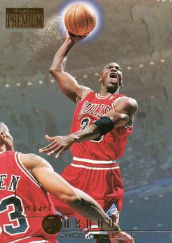  And I'd say peak SkyBox really came when corporate handed "Fleer Metal" over to the SkyBox team who then rebranded it Sky Box Metal Universe". We tend to omit the brand names for understandable reasons, but makes us I think not realize the scope of the change in process and structure from one year to the next.  (I'll also add '97-98 SkyBox Metal Universe also has a completely unique resonance based on its parallels. The nature of the saturated monocolor designs gives a sense of being physically overwhelmed. As one would imagine experiencing as witness to an explosion, or perhaps to having the world lose clarity while rapidly losing consciousness. This resonates with the implied motion and background context of the Jordan card gloriously.) (I'll subtract that it's hard to justify too much worship of the set when you see a card like TMac's. What were they thinking?) But this isn't just a post mourning the loss of a beloved thing from the past, there are more subtle motion-implying designs in today. I'll lead with my favorite design from childhood to emphasize more subtle ways in which motion can be implied. It's a design I couldn't have told you at the time why I liked so much at the time, but I can describe it in retrospect. '90 Leaf baseball    There's an elegance to design from the start, but there's more that bottom left corner than just silver. First, I tend to think it was inspired by the fanning of actual leaves in plants.  Whether that's true or not, that's always how I think of it. But the thematic resonance of the set relating to its etymology isn't what makes the set pop. The key to the pop is the implied rotation. Baseball is a game built on rotating motion. A swing, a throw, even a trip around the diamond. Baseball is a twisting thing. With that implied rotation, the images spring into motion in our mind. Some cards work better than others of course, but when it worked, the cards felt considerably more alive than those of their direct rival over at Upper Deck. Really, just a perfect design for baseball, and it's funny because they completely went away from this design concept the next year, which I think was just an awful mistake. One other note: Have you ever thought about why pinstripes work so well for baseball uniforms, and not as well for basketball? Consider the fact that in baseball, a sport where motion is often relatively small and subtle, the stripes help us see and appreciate the motion that is occurring. In a sport like basketball though, we actually get to see long arms, longer legs, lots of running and obvious changes to motion, and a better view of facial expressions, so maybe uniforms that are too busy only get in the way. Okay, so what other sets have stuff fitting in the category? Here are a few that stand out to me: '04-05 Topps Pristine - the use of lines as turbulence is pretty novel. SkyBox touched upon this, but Pristine did it really well. (Note, the previous year's Finest looked similar superficially but they used the same shape on every image, and it really annoys me.)  '04-05 Ultra - Ultra's cursive designs are mostly awesome across the board, but I'll note this year with the way the "signature" a) has a slight rise to it, b) ends in something of an arrow head, and c) is placed to allow it to serve as something of a springboard. Not all the images in the set work like this, but many do.  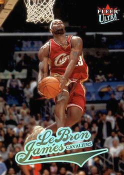 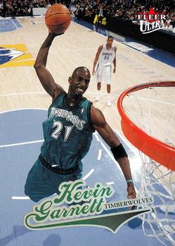 '05-06 Upper Deck Trilogy - There's so much I love about this design. From the start, you have the bold use of not one but two team colors. I find that there's something special to this that only fans can really understand. I'm not looking to advocate for orange & purple fashion trends, but if you have warm & fuzzy memories of those Suns teams, those colors kick up the sentiment for me really effectively. Next there's the fact that UD still manages to keep the play the player is in visible, which aside from being a good thing in general, allows Nash to look like he has extra arms. That might seem like just a funny thing, and it's certainly not a set wide thing, but I'd note that there's an "angel wing" effect to the design of the curves. If baseball twists, basketball swoops. Both the players, and the arcs on the court which likely serve as the foundation of the design. But it's the angel wing effect that really elevates - ha! - the imagery so well.    What about the Panini era? Well, truth be told I think this hasn't been a huge focus for them in the way I've described. They've focused more on capturing motion following refracting-model. Making the image feel more dynamic by the way the light changes as you turn the card in your hand. That's Prizm's Prizms of course, but it's also in a lot of base sets at this point. Nevertheless, some Panini sets and also have something that resonates with me along these lines. 2015-16 Revolution - the first (Panini) Revolution has this (shout out to Pacific, maybe the most intriguing company of the '90s behind SkyBox), but it's proven not to be a rule. The key is in making a design whose components can parallel the motion of the man. Later holistic designs without this component resonates don't have the same motion effect.    2016-17 Prizm - the best Prizm design comes with just two swatches of team color, but they pack a punch in terms of bringing menace even to stationary subjects.  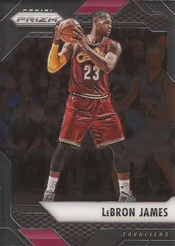 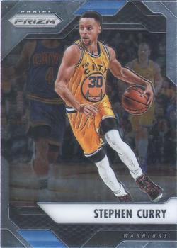 2018-19 Donruss/Optic - I raved about this design in my Meta-Donruss thread. Very much a design designed for swooping.  2019-20 Elite - A few months back I'd have singled out Certified from this year's sets, but then I got a better sense of what Panini had done with Elite. I kinda wish they'd renamed the program because I don't see anything in common with earlier Elite. They began the revamp in '18-19 within Chronicles, but the thing that works about the design I'm highlighting is specific to the '19-20 design. Notice first the angle to the design, and the way they've injected that into the court scene without losing the feel of an in game moment. Notice also how with the Luka image the leftward arrows accentuate his turned gaze. I find that Luka is a tough guy to capture in a card. More than anything else, he's someone who looks absolutely comfortable and in command of the ball in his hand, while having his attention turned toward everything else that's going on in the floor. This card captures that beautifully. And while not every card has this, I see a strong them of looking to choose photos that can heightened by the background design. 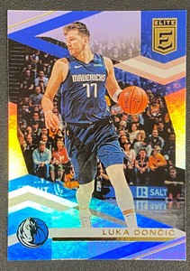
|
|
|
|
|
03-07-2021, 06:01 PM
|
#14 | |
|
Member
Join Date: Sep 2020
Location: Long Beach, CA
Posts: 918
|
Quote:
I'm enjoying just targeting singles I want for the most part, but every once in a while I think about the fun of opening boxes and remember that that's not even a practical option any more. |
|
|
|
|
|
03-07-2021, 06:18 PM
|
#15 |
|
Member

|
2008 Topps Chrome. IMO the best photography of any basketball card set.
__________________
IG: @putnamcards 
|
|
|
|
|
03-07-2021, 06:28 PM
|
#16 | |
|
Member
Join Date: Sep 2020
Location: Long Beach, CA
Posts: 918
|
Quote:
|
|
|
|
|
|
03-07-2021, 09:51 PM
|
#17 |
|
Member
|
I stopped collecting around 2005 and got back in to pick up some set-fillers five or six years ago. Regretfully, I also sold off some of my better PC cards five or six years ago. Wish I had kept them now, with the current crazy prices.
My two favourite brands are topps chrome #1 and topps finest #2. I like the shiny chrome and the rainbow refractor effect. I really like the design of 2002-03 finest and the fact the auto's were on-card, not stickers. 2003-04, and 2004-05 finest are attractive as well too though. My #3 favourite brand would be Bowman/Bowman Chrome, especially Bowman Chrome. #4 is topps. While I like Upper Deck's products their designs and cards were not as affordable or attractive as topps products in general. |
|
|
|
|
03-07-2021, 11:09 PM
|
#18 | |
|
Member
Join Date: Sep 2020
Location: Long Beach, CA
Posts: 918
|
Quote:
Interesting the lean so clearly toward Topps over Upper Deck. Seeing a lot of stances one way or the other. |
|
|
|
|
|
03-08-2021, 06:58 PM
|
#19 |
|
Member
Join Date: Oct 2020
Location: Pennsylvania
Posts: 69
|
Great topic! Really enjoyed reading the posts above.
There are really only two fundamental reasons that I go after certain cards. Main reason: I want the card to capture a moment from a game during a particular season. This helps jog my memory of watching that team/player from that season or in some cases, creates a new memory if I didn't see much of that team because they had a bad record, etc. I find this inherently pleasurable to "re-live" what happened in my imagination. It helps if the image captures what was happening among multiple players at the time so showing more than just a close up of a single player is important. The statistics on the back are also important because that provides another piece of what happened during that year. As you might have guessed, this gives me a strong inclination to go after Topps products especially Stadium Club. My favorite Stadium Club releases are 97-98, 98-99, 00-01 and 07-08. Best choice of photography and gloss (with the first three). I feel like these make me feel like I'm at the game watching the play unfold. Even the original 92-93 stadium club is nice though I'm pretty sick of it by now after going through thousands of cards from this set over the last several years. 06-07 Topps Full Court also deserves a mention here. The basic Topps brand (and chrome) can sometimes be just as good as stadium club in this respect, especially 08-09 (as you noted) and probably also 06-07 and even 09-10. Fleer Ultra sometimes comes close, but I feel like the photos are usually too zoomed in to get a sense of the whole play. The second (and less significant) reason that I would go after a set is simply because I like the design usually because it's different, innovative, and/or reflects a technological advancement. Here, I have a handful of favorites: 97-98 Metal Universe and Metal Universe Championship: Possibly the riskiest sets ever made because they are so different from anything else. I like it because it pushed the envelope and tried something new. The designs frequently don't make sense to me but that's part of what I enjoy about it. It's a shame that in the 23 years since these came out, nothing comparable in terms of truly novel designs has been attempted. I'm not an expert on graphic design nor in printing technology, but it really doesn't seem like it would be that difficult to create something like this. What is missing, it seems, is courage. 96-97, 97-98 Topps Finest: Innovative for its time and looks amazing IF YOU TAKE THE PEEL OFF. Just pick a couple of low value cards and do it. You'll thank me later. 04-05 Topps Pristine: Looks amazing when you hold it in your hand. Feels great too because it's so smooth. 03-04 Pristine is nice too. 04-05 Flair: My favorite "simple" design set ever. Extremely basic, but really works. I feel like this is what Upper Deck has aimed for with numerous designs (SP Authentic, Ultimate Collection) but never quite achieved. 99-00 SPx: This has my vote for most under-rated set of all time. Here is where the holographic technology really shines and makes for a gorgeous set that looks even better in hand than in pictures (trust me). Probably under appreciated because the rookies suck from that year and this is pre-LeBron and post-Jordan but I'm just talking about design. By far, my favorite Upper Deck release of all time. You'll notice that I haven't mentioned Panini. Sadly, they have yet to produce a product that impressed me. Photos aren't exciting enough, don't show enough of the play to give me that game feel, and the overall designs are amateurish in my opinion, especially when compared to any of the sets I mentioned above or that others have discussed so far in this post. With current prices, I honestly don't believe that I'll purchase any more basketball cards for a very long time. And that makes me sad. |
|
|
|
|
03-08-2021, 09:28 PM
|
#20 |
|
Member

Join Date: Aug 2012
Posts: 4,209
|
1996-97 Hoops (Series 2) - I didn't take any photo, but plenty should be easily found online.
The Series 2 of this product is the first ever product in my memory that I opened, the first product that I hit an autograph card from (still keep the autograph card to this day as part of the now complete set), the first product that I opened a complete box of years later, as well as the only product to this date that I enjoy both hobby and retail versions. If I am correct, the product is also the last one, at least the last of the Hoops product line, that features coaches on base cards, which is cool.
__________________
Instagram (IG): bjho852 |
|
|
|
|
03-08-2021, 11:30 PM
|
#21 |
|
Member

Join Date: Mar 2011
Posts: 851
|
That's interesting about cards with photos implying motion. I always loved the 1993 Skybox Premium set in particular.
 Also, the 1998 set is outstanding. Really nice, if understated, cards. I was looking at the Carter the other day and appreciating what nice cards they are.  Another set I love is 2009-10 Topps/Chrome basketball. I love how they went with the white borders on the front but black borders on the back, which added some condition complexity to a set not otherwise really known for it. Also, the photography is so good scrubs like Pops Mensah-Bonsu look good enough to frame.  Lastly, I'd like to give some love to 1998-99 Topps Apparitions. Great set name, good photos, cool design. Condition sensitive. It kind of has it all. 
|
|
|
|
|
03-09-2021, 12:12 AM
|
#22 | |
|
Member
Join Date: Sep 2020
Location: Long Beach, CA
Posts: 918
|
Quote:
Re: Metal Universe. Really does stand alone. The fact that there was only one year in basketball that really went full "universe" adds to how singular it is. Re: Metal Universe Championship. Really that one too? That makes me think there's something I'm missing. I see MU as essentially a set of sketch cards by Marvel artists. I was thinking that MUC look like something that was more of a template. Am I wrong? Is there more to it? Re: Pristine. I've not seen and felt these in hand. I wondered if the name "Pristine" implied a unique card material or manufacturing process. Sounds like you're saying that may be the case. Care to elaborate any further? Re: No Panini. Yeah, I getcha. Photography is not where they've put their focus to this point, and I have to say, it doesn't seem like it's hurt them at all. I'd really like to get something of a fan movement together to push Panini in particular to make sets with folks like us in mind. I will say, I have some hopes for both Luminance and One And One going forward. I'll also say that I think Hoops has been pretty good most Panini years. Re: Not basketball cards. What will you be collecting? Sport? Products that mean with your eye's approval? |
|
|
|
|
|
03-09-2021, 09:02 AM
|
#23 | |
|
Member
Join Date: Oct 2020
Location: Pennsylvania
Posts: 69
|
Quote:
Unfortunately, I don't have more information about the technology for how Topps Pristine was produced and if different materials were used than for other sets. Something about the feel of the cards is especially smooth and this experience of smoothness is enhanced by the look of the card. In my view, a highly under-appreciated aspect of the aesthetic experience with cards is how they feel. The tactile appreciation doesn't rival the visual experience, but is still significant. There are so many interesting textures in cards whether it's the bumpy texture of metal universe, the glossy texture of flair showcase and some stadium club, the smoothness of topps pristine and topps chrome, the acetate cards like E-X2001, 03-04 E-X, etc, the filmy texture of E-X2000 and even the old school cardboard grainy feel of vintage and topps heritage, fleer tradition. This is part of the reason that I'm so against card grading because once a card is slabbed, nobody will ever have a chance to appreciate its tactile feel. I don't see Panini making any dramatic changes to their products simply because they have no financial incentive to do so. The demand is so high that whatever product they put out will be bought. I agree that Hoops has been decent. I've definitely enjoyed opening several boxes of Hoops each year from 11-12 to 18-19. But I don't think I ever paid more than $70 per hobby box, which now seems like a laughably low price. The photography doesn't compare to Topps/Stadium Club though. I'll keep my eyes open for Luminance and One and One. My next collecting endeavor is going to be native plants. Once a collector, always a collector... |
|
|
|
|
|
03-09-2021, 09:08 AM
|
#24 |
|
Member

|
Hoops. It's such a throwback to me. I got into Basketball cards right when 1989 Hoops came out. Great photos, cheap price, a big chase rc - it was the new kid on the block and many who were new to the hobby at the time relished in that.
__________________
Collecting: Raptors, Canadian Basketball Players, Vintage & More. PC: https://www.instagram.com/smalltown.cards/ |
|
|
|
|
| Bookmarks |
|
|


 Linear Mode

