
|
|
|
|||||||
| BASKETBALL Post your Basketball Cards Hobby Talk |
 |
|
|
Thread Tools | Display Modes |
 01-09-2021, 05:54 PM
|
#1 |
|
Member

Join Date: Sep 2020
Location: Long Beach, CA
Posts: 918
|
Was inspired to write something with a lot of visual information about the influences on Panini's Donruss designs.
Interested to share and discuss design, and also to learn from others who've noticed things I have not. So without further ado, below are the main influences I see on Panini's Donruss sets from 2010 to 2021: 1984 Donruss -> 2010 Donruss  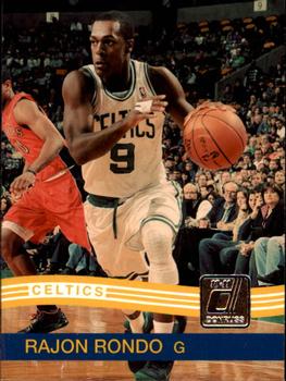 This is an exceptionally literal repeat of the '84 Donruss set, so not much explanation required here. 1984 was seen as the breakthrough year for Donruss so it makes sense they'd look to start here, but I have to say I don't think the design really works. 2 main issues I think: 1 - You can't go full retro and impress people now. What was impressive back then, just isn't that impressive by today's standards. 2 - The stripes don't work. In the baseball design, they seem like they are floating in the breeze outside (where baseball is played). In the basketball design there's a claustrophobic feel that they made worse by making the stripes entirely opaque, and they moved up the bottom bar which makes it look like view of the player is is deprioritized behind not just one but two design flourishes. They didn't do another Donruss set for years, and I'm glad. They needed a reboot, to my mind, and when they came back, they had figured something out. 1985 Donruss + 1987 Donruss -> 2014 Donruss 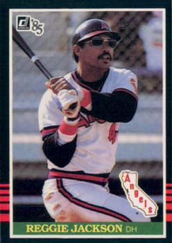 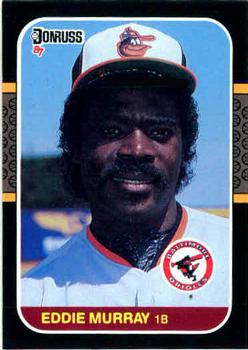 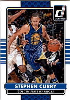 Now we're talking. They take two blah horizontal designs, rotate one to the vertical to create a flag-like cross, and emphasizes better the verticality of basketball. They replace the little tiny baseballs with little tiny basketballs. They made the background border white instead of black, light instead of dark. Frankly I think this would be an improvement in any sport, but for an indoor sport like basketball, the light really helps in most cases (if you're going to go dark, you really gotta commit). They also gave vibrant team colors which is possibly the biggest improvement of all. This design was huge and formed a key influence on the concept of Panini's Donruss, even if subsequent Donruss designs haven't been that close to this one. 1991 Donruss + 2014 Donruss -> 2015 Donruss   Another beautiful design. Team colors even more emphasized this time. One interesting thing: The 1991 design is the primary influence, but it itself is patterned off the 1986 Donruss design which I personally like better. But the 1991 design is better-suited for emphasizing team colors (even if the 1991 set didn't do that). 1990 Donruss + 2015 Donruss -> 2016 Donruss & Optic   This was the first Donruss design I saw when I jumped back in the hobby during the pandemic, and I found it to be fascinating. 1990 was when I came of age as a collector and I remember the Donruss design being reviled by many. But once you make the color scheme team-based, it really works and remains very distinctive. This was a wise choice for the first year of Optic. One thing though: I hate the brown designs Panini gave the non-Optic set this year and the next. White hate been the throughline of the set the previous two years, and to give that only to the premium variant while giving base Donruss paper bag colors is undignified in my book. 2016 Donruss & Optic -> 2017 Donruss & Optic  I may be missing something here. This largely looks like a slight tweak of the previous design with a lot less color. Seems pretty boring to me. 1984 Donruss + 1993 Leaf + 1994 Leaf -> 2018 Donruss & Optic    This design really blows me away. First, contrast the use of '84-like lines in 2018 to the 2010 set. Now the lines imply motion and flight. Beautiful! I'd like to see them play with this further. Second, I think they clearly made the base of their design primarily around old Leaf designs rather than old Donruss designs. Funny given that Panini sold the rights to Leaf. I think they should do more of this, to the extent they can get away with it. 1993 Donruss + 2018 Panini Stickers -> 2019 Donruss, Optic & Clearly   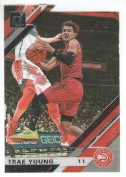 I'm being generous here calling '93 Donruss an influence. I think it is one, but to me the 2019 Donruss designs really look like the sequel to the 2018 Panini Stickers set, which is not a compliment. Definitely a disappointment here for me. 1983 Donruss + 2016 Donruss -> 2020 Donruss   Alright, a couple things here: 1 - It's weird to me that we don't see a white base card in the '20-21 Donruss basketball sell sheet given that white has been so emphasized by Panini with this brand previously, and that both 2020 baseball and football have a white border. The language they use is unclear, but it kinda seems like they only included parallels and forgot the actual base. If that's not the case I'll have to grapple with the color choice of the base a bit more, but holding off for now and so using the football design for reference. 2 - Originally I only saw the commonality with 1991/2015/2016/2017 design and I was disappointed here. But seeing the bright white background of the football set made me see a further connection to 1983 Donruss (which itself is influenced by 1982). They were clever here. They couldn't make a direct analogy to a baseball bat in other sports, so they went a bit abstract while keeping the warmth/fun feel of the '83 set. I'm still more impressed with the innovations from 2014 & 2018, but I like the 2020 design here. It feels both retro and progressive. Alright, thanks for reading y'all! Cheers, Tallboy Last edited by Tallboy; 01-09-2021 at 08:26 PM. |

|

|
|
01-09-2021, 07:06 PM
|
#2 |
|
Member

Join Date: Nov 2014
Posts: 7,694
|
This is an exceptional post. Thanks for piecing all of this together!
__________________
He said he name was E, so I introduced myself as G...The license plate said IMNBITZ or IMNBISZ or something. - G YouTube channel: https://www.youtube.com/channel/UCPuD3WYJ0rkpLqDdyavC2WA |

|
|
|
01-09-2021, 09:34 PM
|
#3 |
|
Member

|
Agreed, excellent post. You've done an impressive amount of research and laid everything out very clearly and thoroughly.
I'm not much of a Donruss (or Optic) fan. I know that Panini has very few original designs and ideas, but the rehashing of these older designs is unimaginative and lazy to me. Plus, as you suggest, designs that were nice 20-30 years ago are just outdated nowadays. I suppose Panini could be using Donruss as a "tribute version" of their low end brand. So Prizm is their modern brand with new, original designs and Donruss/Optic are the tribute sets with the rehashes of old designs. I agree that the only year that actually looks modern, innovative, and frankly, good is 2018. Some design elements may be inspired from previous releases but they are implemented in original, beautiful ways. I like the connection you make to the illusion of motion and movement. Really great breakdown. I'm impressed so far with what I see of 2020 donruss. Looking at the mock ups after reading your post, I get the same vibe of movement that you mentioned in 2018. I like it, but it's a bit box-y for me. I think curves and swoops would be much better. I would actually welcome the lack of a white base design: it's that way almost every year. The brown from 2017 definitely didn't look great but I appreciate the variation from the white bordered base. But it looks like they do have a pure white base based on the attached coby white mock up. The lasers and/or action shots (Trae and nunn) look soooo good for this year. Sent from my SM-G960U using Tapatalk 
__________________
PC: Sacramento Kings and Cleveland Indians Looking for these cards: 1. 2018-19 National Treasure Tim Duncan Game Gear /10 (non-trim) 2. 2016 Kawhi Leonard Hoops Base Parallels (and Bird's Eye View Gold /10) |
|
|
|
|
01-10-2021, 11:29 AM
|
#4 | |
|
Member
Join Date: Sep 2020
Location: Long Beach, CA
Posts: 918
|
Quote:
|
|
|
|
|
|
01-10-2021, 01:06 PM
|
#5 | |
|
Member
Join Date: Sep 2020
Location: Long Beach, CA
Posts: 918
|
Quote:
First thing I'll say is that it's just fine for you to have the preference you do, and if you particularly like Prizm, then you're clearly in tune with the collective mind of the hobby, which is not a bad thing. I'm not in tune with that collective mind, but I am trying to understand it. My perspective when it comes to brand analysis here is in the recognition that Panini was attempting a particular task here that they recognize that if it were successful would drive the creation of a strong niche, and they pulled it off despite an initial failure. In this sense, the key point is that Donruss and its sub-programs are not really in competition with Prizm. Yes, if Optic is successful enough it may become more valuable than Prizm and that will mean people making decisions between the two brands with their wallet, but the foundational appeal of Donruss is what allows for a program like Optic to launch, and that foundational appeal is very different from the foundational appeal of Prizm despite the fact that Panini is using many of the same flourishes (refracting rainbow parallels) as icing on the cake for both brands. I make this thread about Donruss because this involved a specific process of design in order to produce the authenticity required to trigger the requisite latent energy of nostalgia the brand would need in order to stoke collector interest, and we can actually see it if we look closely! I'll also say that frankly this is more interesting with Donruss than Prizm because the Prizm brand has shown very little new design after its successful debut. I'd say that Panini operates very conservatively with its brands so long as they are successful, and I can't fault them for this - I think it's smart. One of the things that's counter-intuitive is that it's actually in a retro brand that Panini is showing some of its most innovative year-to-year design. By placing their design (largely) under constraints of an earlier aesthetic, it's actually allowing Panini to be more creative with Donruss than pretty much all of their other perennial brands' base designs. (To be clear, the main design focus of Panini is clearly on creating new brand designs, which they do with remarkable prolific ease.) Particularly glad you appreciate the discussion on embellishing motion in design. This is an area with so much potential that I don't think has been well-mined by the card industry. Many attempts in the past have failed, but I think many of the great designs that resonate with collectors have an implicit kinematic component to them. And yup, I think swooping motion is often more evocative than straight lines, which are indeed making something of a boxy feeling here. Though as I say that, designs can do wonders with radial lines to imply motion - and there is a touch of that at the bottom here in the non-rookie design. Tangent: It's really annoying to me when sets use a different design for rookies, and the design isn't as good as what the veterans are getting, and Donruss has had a real penchant for this with the most egregious for me being '18-19. Real bummer we don't get to see Luka with the "stripe & swoosh" design. I get that there's a specific challenge making cards for guys who haven't appeared playing in uniform yet, but some sets rise to that challenge more effectively than others. |
|
|
|
|
|
01-10-2021, 01:46 PM
|
#6 | |
|
Member
|
Quote:
|
|
|
|
|
|
01-10-2021, 03:02 PM
|
#7 | ||
|
Member
|
Quote:
But I actually agree with your key point of Prizm and Donruss/Optic almost having different target groups. I hadn't considered that before reading this thread because I wasn't aware of just how much homage Panini was paying to previous Donruss designs. I have quite a paltry history with the pre-2010 hobby, mainly sorting base with my older brother in the mid-90s, so I hadn't really considered the appeal for those who had collected in the 80s and 90s of a set designed as a modern take on a nostalgic set. Nostalgia which I inherently lack because I wasn't really collecting much then. It's a great move on Panini's part both for their business, but also for their collectors. And I definitely feel like I have some more appreciation for Donruss' place in the basketball card world! I'm interested in what attempts to embellish motion in designs you feel have failed? I've especially noticed it in 2018 Optic and some recent Immaculate releases (especially 2019). You know, I'm embarrassed to admit I didn't even notice that 2018 Optic's rookie cards differed in design from the vet base. I guess I assumed they were identically designed with the rookies containing studio photos and never confirmed it. I agree there was a lot of potential lost in that choice. On a related note, I just recently started going after a Sacramento Kings team set of 2006 Topps Triple Thread base cards and ran into a similar case in which the rookie base are considered the base jersey autos. It really bugs me because they won't match each other. I decided to forego the rookie altogether. Why not make the base identical and then a special rookie insert set for whatever alternate designs for the release? Plus, I think one of the recurring shames of Panini's products is that Optic RCs contain studio photos. Why not push the release back a month and include in game photography? Prizm and Donruss already have studio photos, not sure why they don't differentiate Optic with in game. Quote:
__________________
PC: Sacramento Kings and Cleveland Indians Looking for these cards: 1. 2018-19 National Treasure Tim Duncan Game Gear /10 (non-trim) 2. 2016 Kawhi Leonard Hoops Base Parallels (and Bird's Eye View Gold /10) |
||
|
|
|
|
01-10-2021, 03:47 PM
|
#9 | |
|
Member
Join Date: Sep 2020
Location: Long Beach, CA
Posts: 918
|
Quote:
But, I'll tell you, it goes deeper back into history than perhaps anyone in the modern basketball hobby realizes. Check this out:   When Topps launched the set that would first kick up the basketball hobby back up to "every year" status, they did so by borrowing heavily on a Baseball magazine design from the '30s. People in 2020 probably look at the 1969 Topps set and think "Oh that looks old timey, I guess that's what the style was 50 years ago". Nope, that's what the style was 90 years ago. Topps was making a retro statement even then. I've got a lot more to say on the '69 Tallboy set, but I'll refrain for the moment. Suffice to say, Topps was smart about this stuff a long time ago (though not necessarily consistently so). So what Panini America is doing is essentially being the first non-Topps trading card company to show they get this. And yes, that is meant as a criticism of other companies, and the misuse of Fleer (by Fleer, Marvel, and eventually Upper Deck) specifically with a lack of understanding of how to really trigger nostalgia obliquely. If Upper Deck ever gets a license for NBA again, I'd argue that one of the most important things for them will be to make Fleer resonate nostalgically. You've got to do more than just a boring design and call it "Retro". |
|
|
|
|
|
01-10-2021, 04:30 PM
|
#10 | |
|
Member
Join Date: Sep 2020
Location: Long Beach, CA
Posts: 918
|
Quote:
Yes, I'd agree there's a high-end trend toward same-old design in particular, and I'll add that I see the roots of this with the '98-99 SP Authentic set. Compare that set with the prior SP Authentic set: '97-98 vs '98-99:   A bit like the shift from '10-11 Donruss to '14-15 Donruss with the most from dark to light. Also, note the similar oval design from '69-70 Topps. I'd like to believe Upper Deck referenced the Topps design on purpose because that's part of why it works, but Upper Deck has often seemed to design with a futurist mindset so it might just be a coincidence. Regardless, after the success of the '98-99 SP Authentic set, Upper Deck really seemed to focus on fancy-white designs for that program and anything they were trying to convince the hobby world was even more premium. To me the key test case was '03-04 Exquisite and it passed. From that point on, super-super premium stuff is essentially modeled after Exquisite, so that's what Panini is doing with most of the most expensive stuff. I'd note an analogy to design from Apple, who with the rise of the iPod/iPhone turned away from the rainbow-colors that had previously dominated their branding to a focus on a clean, restrained greyscale with a particular emphasis on white.  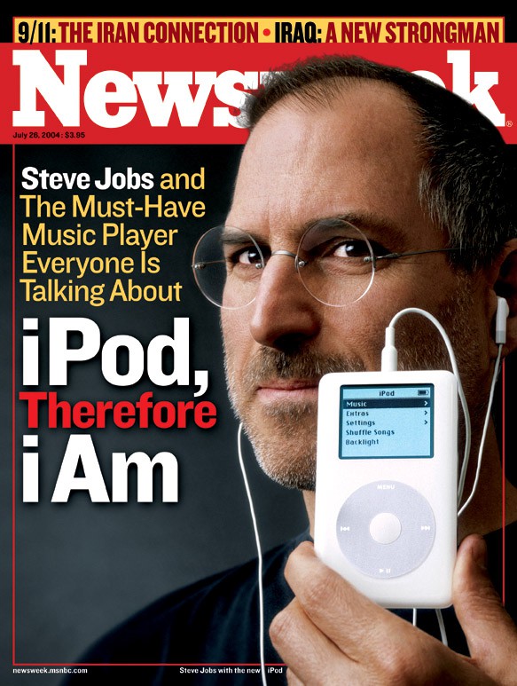 The interesting thing to me is that trading cards did this before the iPhone. This "exquisitely clean" notion of highest premium has been around for forever - see marble statues - and thus doesn't come from the hobby, but the hobby went in this direction before Steve Jobs did. Re: Prizm disappointing lack of new design. I think the thing is that Prizm is something whose entire purpose is allow the background to reflect light brightly, and hence there's really not room for that much variation. Even when they make really nice improvements, like in '16-17 where to me they peaked in their design, it's still not the focus of the design. The focus of the design is in the shine. Re: subsets. I'll say there's certainly creativity going into Inserts now, and some are quite charming. Re: helped you appreciate Donruss more. Cool! Yeah, I think it's really interesting to look at designs that are going for something distinct rather than simply "better". The reality is that Panini has done this more methodically than I think any company has done before. They still have some pretty major "blind spots" imho, but I'm impressed by how they've built out their portfolio. Examples of failed motion-based designs? Sportflics - aka "lenticular". True motion in the design, early attempted as "premium" baseball cards in 1986. Collectors turned up their nose.  Action Packed - aka "embossed". Designed to allow you actually allow you to "feel the action" by embossing the shape of the player. Another premium attempt, the hobby was luke warm on it.  Upper Deck's various attempts on holograms as a focus. Collectors like a dash of holograms, but they making holograms the actual focus of the design was a wave that dissipated. I believe that Wax Museum has an episode talking about Upper Deck not being interested in chromium tech because they were focused on hologram tech.  And then most tragically "Inaugural" SkyBox, whose early work is tremendously influential on Panini today with their use of abstract background, but didn't quite get that if you're going to use color, you should probably make it bright. Also, the fact they made too many cards and didn't have any rookies really pan out hurt a lot too.  Of course, that's not to say that SkyBox didn't have success, with the '97-98 Metal Universe set - the year "Fleer Metal" got handed over to the SkyBox design team - being the one that resonates most decades later. 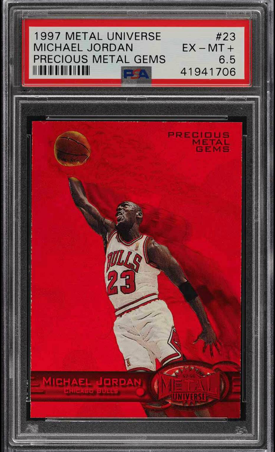
|
|
|
|
|
|
01-10-2021, 04:30 PM
|
#11 | |
|
Member
Join Date: Sep 2020
Location: Long Beach, CA
Posts: 918
|
Quote:
|
|
|
|
|
|
01-10-2021, 04:48 PM
|
#12 |
|
Member
Join Date: Feb 2013
Posts: 549
|
This is really interesting, thanks for doing this. I knew the 2016 Optic design looked familiar, I just never connected the dots.
|
|
|
|
|
01-10-2021, 04:53 PM
|
#13 |
|
Member

Join Date: Jul 2008
Posts: 3,919
|
Thank you for a great community post! Excellent work!
__________________
UCLA CLASS OF 2002 |
|
|
|
|
01-10-2021, 09:22 PM
|
#14 |
|
Member

|
Nice post! I've always been partial to how the 1993/94 Leaf series looked with hockey, but still looks just as sharp for baseball as well.
|
|
|
|
|
01-10-2021, 10:01 PM
|
#15 |
|
Member
Join Date: Aug 2019
Location: St. Louis
Posts: 550
|
Nice stuff here — love it!
__________________
Always Rip |
|
|
|
|
01-12-2021, 04:03 PM
|
#16 | |
|
Member
Join Date: Sep 2020
Location: Long Beach, CA
Posts: 918
|
Thanks to everyone for their kind words!
Quote:
Back in my collecting childhood, the 1990 Leaf baseball set was the one I really fell in love and from that point on I was partial to sets by Leaf, though only some of them. 1990 Leaf baseball was fantastic, and I though '93 & '94 hit some of the same notes after '91 & '92 basically showed that they were just guessing as to why the '90 design worked. ('90 Leaf design - note the subtle implication of rotational motion in the silver fan, perfect for baseball.) 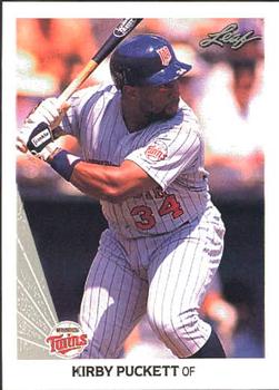 The Studio sets, particularly '91 & '93 I thought were aesthetically distinct and gorgeous. 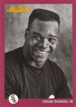 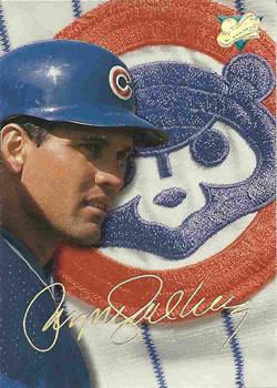 And I want to give a specific shoutout to '95 Leaf Limited hockey given your hockey history, which I thought did such a fantastic job of incorporating the aesthetic of the sport into their super-premium brand. 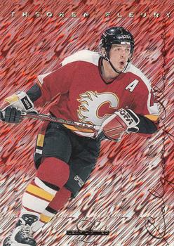
|
|
|
|
|
|
| Bookmarks |
| Tags |
| design, donruss, leaf, optic, panini |
|
|


 Linear Mode

