
|
|
|
|||||||
| BASKETBALL Post your Basketball Cards Hobby Talk |
 |
|
|
Thread Tools | Display Modes |
 01-05-2022, 07:52 PM
|
#151 | |
|
Member

|
Quote:
__________________
IG: Darz90sCardz PC: MJ/Penny |
|

|

|
|
01-05-2022, 08:26 PM
|
#152 |
|
Member

Join Date: Jan 2011
Location: All the girls see the (boi)/ Look at his flips / Look at his kards / All they say is (oh boi).
Posts: 56,738
|
Aside from the beautifully complex and intricate foil etching, the thing that really set the OG pmg's apart from the field were the bespoke background designs. Regardless how ill-fitting or ridiculous, nearly every background was uniquely improvised and tailored to each player. They had to do this for large checklists across all major sports.
That's a level of care and craftsmanship that we'll probably never see again from kard manufacturers. About the closest Hackler's ever come to that level of ingenuity was the Downtown line, with a checklist of around 20 players. And even then, you'll still find out later down the line that the design team plagiarized some c-list artist on twitter (see: Justin Herbert).
__________________
#5 world ranked Ledell Eackles superclection as recognized by Tuff Stuff junior managing editor, Barry McCaulkinner. Somethin' like a cross between Teddy Aguhob and Kaboom Mystery Packs. I got that Givenchy denim flow.
|

|
|
|
01-05-2022, 09:41 PM
|
#153 | |||
|
Member
Join Date: Mar 2018
Posts: 231
|
Quote:
 Quote:
 Quote:
Last edited by Proton; 01-05-2022 at 09:44 PM. |
|||
|
|
|
|
01-05-2022, 09:46 PM
|
#154 | |
|
Member

Join Date: Sep 2016
Posts: 9,413
|
Quote:
__________________
~~~ '90s trading cards === Golden Era ~~~ |
|
|
|
|
|
01-05-2022, 09:50 PM
|
#156 |
|
Member
Join Date: Dec 2019
Posts: 500
|
OP: Insightful write-up, thanks for sharing. Definitely made me think more about this set which is much appreciated. A few thoughts/questions:
1. Titan is mainly orange with two areas of haze in the atmosphere. Be careful though as these areas are sometimes falsely colored blue/purple to help distinguish between layers. Link: https://www.nasa.gov/mission_pages/c...ni-072904.html 2. For the question about other colors that could be used, the color ideally would need to be light enough to show the color of the scope circles when shining a light on the card. Also colors would need to be differentiated from other sets. For example, red, green, and silver are already used with scopes in other sets. Orange could have been a choice but probably doesnt mix well with gold parallel. Blue is too dark if you look at baseball chronicles cards. So maybe only choice was light purple but they mixed in other colors like blue in the card background kind of like a pseudo nebula color scheme. 3. Agree with Ninja about all of the card backgrounds being the same image with Saturn by players heads. If the background images were different then would feel more like the original PMGs. Agree with you though that appears they took some of the same design elements from each original set. One issue though is they still printed too many parallels of this insert. Why even print the non scope cards? Maybe because they werent sure which design was better? 4. The inserts have a nice common theme of the universe but the base cards just seem like a random design. For the atmospheric inserts, appears they might have taken the Earths distances for each layer which seems cool: https://scied.ucar.edu/learning-zone...ths-atmosphere 5. For your point about Easter Egg it could have been so cool if they would have put the last few /38 scopes as a set redemption as it was done with 1997-98 set. Now that would have been an Easter egg! Link: https://www.blowoutforums.com/showthread.php?t=520787 |
|
|
|
|
01-05-2022, 09:52 PM
|
#157 |
|
Banned
Join Date: Jul 2021
Location: Fomenting FOMO on the down low.
Posts: 8,094
|
The Certified inserts add an interesting wrinkle to the debate. There is some Titan lineage through Panini.
Considering an essay on how the 20-21 Flux base is actually a once-in-a-generation homage to the height of greening and in particular the 1996-97 Topp's Best set. Many of the same hues predominate as greened Apprentices, Ballhawks, etc. (Even going back to 95-96 TB). It's not only green... there are interesting reds, browns, bronzes, etc. The difference of course is that one reflects an organic chemical aging process over the course of 26 years and has a chance at patina. The other was designed by some intern who was given free reign at the computer. Last edited by Nomad; 01-05-2022 at 09:58 PM. |
|
|
|
|
01-05-2022, 09:57 PM
|
#158 | |
|
Member
Join Date: Mar 2011
Posts: 19,085
|
Quote:
|
|
|
|
|
|
01-05-2022, 11:32 PM
|
#160 | |
|
Member

Join Date: Oct 2012
Posts: 23,283
|
Quote:
These Certifieds have a certain appeal to them, but where Panini screwed them up was printing too many parallels and too many copies of these parallels. I mean, look at this: Platinum Red /279 Platinum Blue /149 Platinum Red Die-Cut /135 Platinum Blue Die-Cut /74 Platinum Purple /49 Platinum Purple Die-Cut /25 Platinum Gold /10 Platinum Gold Die-Cut /10 Platinum Green /5 Platinum Green Die-Cut /5 Platinum Black /1 Platinum Black Die-Cut /1 That's 12 parallels and 743 parallel copies of each player. Way too much to make it an exclusive set.
__________________
"Whether you like it or not, learn to love it, because its the best thing going. Wooooo!" |
|
|
|
|
|
01-05-2022, 11:36 PM
|
#161 |
|
Banned
Join Date: Jul 2021
Location: Fomenting FOMO on the down low.
Posts: 8,094
|
From one perspective that is only about 2.5 the total Lamelo, Ant, or Wise Titans, given that three versions exist.
|
|
|
|
|
01-05-2022, 11:43 PM
|
#162 | |
|
Member

Join Date: Apr 2014
Posts: 2,341
|
Quote:
Football was much more rare, and looked better with the mirrors not being die cut. I had the mirror green 1/1 rookies of both Carr and Bortles in 14 haha. They didnt have mirror blacks. Football break down was mirror red 25, blue 10, gold 5, green 1. |
|
|
|
|
|
01-06-2022, 12:05 AM
|
#163 | |||
|
Member

Join Date: Sep 2020
Location: Long Beach, CA
Posts: 918
|
Quote:
Quote:
But you're absolutely right that it's a huge difference that MU has different backgrounds for different players, while Flux - and basically everything else - does not. Really sets the '97-98 MU apart as an all-timer for me even if the PMGs didn't exist. Quote:
What I see with the OP is that Panini made a product that made his neurons really start firing and that inspired him to playfully write something up with a lot of images he thought was beautiful. |
|||
|
|
|
|
01-06-2022, 12:54 AM
|
#164 | |
|
Member
Join Date: Oct 2012
Posts: 23,283
|
Quote:
Also, die cuts are typically a limiting factor, other than those sweet sets like Flair Hot Hands back in the day.
__________________
"Whether you like it or not, learn to love it, because its the best thing going. Wooooo!" |
|
|
|
|
|
01-06-2022, 01:40 AM
|
#165 |
|
Banned
Join Date: Jul 2021
Location: Fomenting FOMO on the down low.
Posts: 8,094
|
Oh I thought you were talking about Full Capacity for a second.
|
|
|
|
|
01-06-2022, 09:39 AM
|
#166 | |
|
Member

|
Quote:
If you like the movie themed cards, Hoops did an Arceologists set that gives a nod to Indiana Jones. Sent from my iPhone using Tapatalk |
|
|
|
|
|
01-06-2022, 12:44 PM
|
#167 | |
|
Member

|
Quote:
|
|
|
|
|
|
01-06-2022, 12:47 PM
|
#168 | |
|
Member
|
Quote:
__________________
Cards: http://www.instagram.com/cardcollecting82 My artwork: http://www.instagram.com/sebreg Flickr: https://www.flickr.com/photos/190656817@N03/albums |
|
|
|
|
|
01-06-2022, 01:12 PM
|
#169 | |
|
Member
|
Quote:
I think the closest Panini has ever got to this was Gyulas 2014 cards. 50 player checklist, each with original artwork. Just like the old Duncan yo-yo commercials If it aint a Gyula, give it to him. 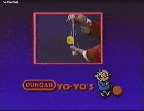 Sent from my iPhone using Tapatalk |
|
|
|
|
|
01-06-2022, 02:04 PM
|
#170 | |
|
Banned
Join Date: Jul 2021
Location: Fomenting FOMO on the down low.
Posts: 8,094
|
Quote:
|
|
|
|
|
|
01-06-2022, 02:27 PM
|
#171 | |
|
Member
|
Quote:
__________________
Cards: http://www.instagram.com/cardcollecting82 My artwork: http://www.instagram.com/sebreg Flickr: https://www.flickr.com/photos/190656817@N03/albums |
|
|
|
|
|
01-06-2022, 02:41 PM
|
#172 | |
|
Member
|
Quote:
Its also worth noting the design work deteriorated every subsequent release. While the OG 97 had unique designs, 97 championship used city photos (still clever but not time intensive), 98 used game photos (even less time intensive), 2008 used the same digital black space background throughout. Sent from my iPhone using Tapatalk |
|
|
|
|
|
01-06-2022, 02:49 PM
|
#173 |
|
Banned
Join Date: Jul 2021
Location: Fomenting FOMO on the down low.
Posts: 8,094
|
Wasn't 97 Championship released before OG 97, same year?
|
|
|
|
|
01-06-2022, 08:55 PM
|
#174 | |
|
Member
Join Date: Jan 2011
Location: All the girls see the (boi)/ Look at his flips / Look at his kards / All they say is (oh boi).
Posts: 56,738
|
Quote:
 Still gives me the warm fuzzies. Panini's design team coming for that Qwasian ACEO crown.
__________________
#5 world ranked Ledell Eackles superclection as recognized by Tuff Stuff junior managing editor, Barry McCaulkinner. Somethin' like a cross between Teddy Aguhob and Kaboom Mystery Packs. I got that Givenchy denim flow.
|
|
|
|
|
|
01-06-2022, 09:49 PM
|
#175 |
|
Banned
Join Date: Jul 2021
Location: Fomenting FOMO on the down low.
Posts: 8,094
|
Nope. Nowhere near. Because still chromium. Not hand designed.
Last edited by Nomad; 01-06-2022 at 11:04 PM. |
|
|
|
|
| Bookmarks |
|
|


 Enjoying the last days of Rome. And the fact that Proton only has doubles of Scope, and not a truckload (and soon not that) speaks volumes as to why I like it.


 Linear Mode

