
|
|
 10-16-2020, 10:34 PM
|
#676 |
|
Banned
Join Date: Sep 2012
Location: Kansas
Posts: 4,421
|
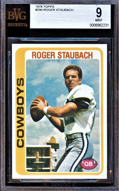
 Just got this in today from a forum member. Goodness this card is a BEAUTIFUL 4.5!!! Sent from my iPhone using Tapatalk |

|

|
|
10-18-2020, 01:49 PM
|
#677 |
|
Member

Join Date: Jul 2018
Posts: 1,199
|
|
|
|
|
|
10-19-2020, 05:25 PM
|
#678 |
|
Member
|
Thanks guys. (from the previous post.) I dig the Ty Cobb and Aaron. Those are both nice. Added another HOF rookie auto.
|
|
|
|
|
10-20-2020, 12:15 PM
|
#679 |
|
Member

Join Date: Dec 2017
Location: Mt Laurel, NJ
Posts: 6,654
|
Mailday today. Love the centering on this card.
 Sent from my iPhone using Tapatalk |
|
|
|
|
10-21-2020, 01:18 PM
|
#680 | |
|
Member

|
Quote:
__________________
They're = they are. Their = possession. There = "I went there." Two = 2. Too = "Me too." To = "He went to the card show." Your = "your cards." You're = "you're welcome." |
|
|
|
|
|
10-21-2020, 01:20 PM
|
#681 |
|
Member
|
Added some new '57's today.
I'm currently pretty obsessed with this set. Already have a Clemente and a Frank Robinson. Now I've got these four. Only others I know I for sure want are a Klusinski because of the awesome photo and a Mantle because it's Mantle.
__________________
They're = they are. Their = possession. There = "I went there." Two = 2. Too = "Me too." To = "He went to the card show." Your = "your cards." You're = "you're welcome." Last edited by YouTheManNick; 08-31-2024 at 03:34 PM. |
|
|
|
|
10-21-2020, 07:29 PM
|
#682 | |
|
Member
Join Date: Aug 2019
Posts: 720
|
Quote:
|
|
|
|
|
|
10-21-2020, 08:35 PM
|
#683 |
|
Member
Join Date: Feb 2014
Location: Minneapolis, MN
Posts: 3,888
|
Added a PC Card to the Koufax collection

__________________
Collecting: Sandy Koufax "Left Arm of God"
|
|
|
|
|
10-22-2020, 08:39 PM
|
#685 | |
|
Member
Join Date: Feb 2014
Location: Minneapolis, MN
Posts: 3,888
|
Thats a beauty!!
Quote:
__________________
Collecting: Sandy Koufax "Left Arm of God"
|
|
|
|
|
|
10-23-2020, 08:04 AM
|
#687 | |
|
Member
Join Date: Aug 2019
Posts: 1,068
|
Quote:
what gives, with the "technical" 4.5 ?? looks like a 7 or 8, easy. and I don't say that lightly. |
|
|
|
|
|
10-23-2020, 12:46 PM
|
#688 | |
|
Member
Join Date: Aug 2019
Posts: 720
|
Quote:

|
|
|
|
|
|
10-23-2020, 05:58 PM
|
#689 | |
|
Member

Join Date: Oct 2013
Posts: 10,231
|
Quote:
|
|
|
|
|
|
10-23-2020, 07:32 PM
|
#691 | |
|
Member
|
Quote:
|
|
|
|
|
|
10-23-2020, 08:28 PM
|
#692 | |
|
Member
|
Quote:
Can't believe you have a whole set. I bet it's pretty amazing to look at all together.
__________________
They're = they are. Their = possession. There = "I went there." Two = 2. Too = "Me too." To = "He went to the card show." Your = "your cards." You're = "you're welcome." |
|
|
|
|
|
10-24-2020, 01:09 PM
|
#693 |
|
Member
Join Date: Sep 2013
Location: KC,MO
Posts: 1,629
|
Not a biggie but I like it
 Sent from my SM-G930V using Tapatalk
__________________
Nescit Cedere Last edited by unitasfan; 10-27-2020 at 09:47 AM. |
|
|
|
|
10-24-2020, 04:42 PM
|
#694 | |
|
Member
Join Date: Aug 2019
Posts: 720
|
Quote:
I have seen higher grade cards with wrinkles. I own a 69 Ted Williams PSA 8 that has something resembling a wrinkle. So even high grades are not immune from this either. The Williams is in an old slab so I wonder if this could have happened after slabbing due to humidity. Probably just missed by the grader though. |
|
|
|
|
|
10-24-2020, 04:56 PM
|
#695 |
|
Member
Join Date: Aug 2019
Posts: 720
|
Here's the 69 Ted PSA 8. I didn't get as good a photo as I hoped, but you can see there's a disturbance circled in yellow. Sometimes it's hard to draw the line on what is acceptable veining related to card texture and what is a wrinkle. There's also bubbles and how to deal with those as a grader. Ironically I have a '57 Ted PSA 6 that has razor sharp edges but I believe it's a bubble that made the grader ultimately decide on 6.

|
|
|
|
|
10-25-2020, 02:58 PM
|
#696 |
|
Member
Join Date: Feb 2014
Location: Minneapolis, MN
Posts: 3,888
|
Just love the 1960 card and added another to the PC. My two favorite Koufax cards are his 1956 and 1960, and just love those sets in general!

__________________
Collecting: Sandy Koufax "Left Arm of God"
|
|
|
|
|
10-27-2020, 10:28 AM
|
#698 |
|
Member
Join Date: Nov 2015
Posts: 743
|
Just picked this up
  Sent from my iPhone using Tapatalk |
|
|
|
|
10-27-2020, 01:05 PM
|
#699 |
|
Member
Join Date: Aug 2019
Posts: 720
|
Man is it hard to find decent quality in vintage baseball these days without paying top dollar. I'm seeing prices continue to go up. Wasn't shopping for this one, but it came up at a good price, so I snared it. I don't find '61 Topps that compelling but I think this is just an awesome portrait of Roberto Clemente. The colors are great too. This one goes into the ol' PC.

|
|
|
|
|
10-27-2020, 04:02 PM
|
#700 | |
|
Member
|
Love it! Have really wanted to pick up a 57 or 61 Topps of Clemente myself lately.
Quote:
|
|
|
|
|
 |
| Bookmarks |
|
|


 Linear Mode

