My sort of thread!

Beginning at the beginning:
'09-10:
Court Kings takes top aesthetic right from the start. And in a year where Panini's autographed cards are mostly horrendous designs, even the sticker auto works here.

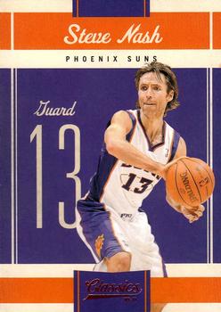
'10-11:
Classics stands out going all in one two-team-color matching. Would get old if done every season so simply, but it makes this release always stand out.
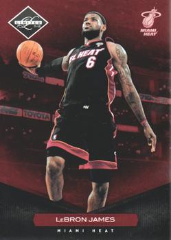
'11-12:
In a year where Panini sabotaged their sets by not including rookies, Limited at least has a glorious design:
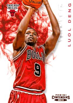
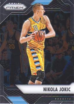
'12-13:
We have to talk about Panini bringing back Pacific's Pris(z)m here. Coming back into the hobby in 2020, it was amazing to see the way Prizm had come to dominate the landscape. In general I personally would side against the aesthetic of the base Prizm on its own, but the "vanilla" design was the perfect way to display Refractor-like rainbows, and that was essential to its success. It was clearly a game changer for Panini.

I'll also shout out the non-rookie design of Contenders. I find Contenders' standard ticket-based design to be quite boring, and really appreciated them going in a different direction this go 'round even if it doesn't seem like it really resonated with collectors. I don't think the sticker autos work well, and since that's what the rookies were, I ding the overall aesthetics of the set, but for the base veterans, this is probalby my favorite of the year:
'13-14:
They bring back Court Kings, it tops the list again, and yeah I'll say that in general Court Kings has been my favorite Panini product. It's interesting because I think it general Donruss' Diamond Kings tended to have pretty unappealing art back when they had an artist actually paint on a canvas, but what they do with it now oftentimes really works for me - though they now try enough different designs, some don't work.

'14-15:
I'm a big fan of stylized black & white done well. To me Noir's debut is the key release along these lines, and I'll say that I'm not a fan of much of what they've done since which makes it feel less minimalistic.

'15-16:
Big fan of Panini's first bring-back of Pacific's Revolution here. Actual implied rotational motion which when done right harmonizes with the action of the player. Team colors that really pop.

'16-17:
Amazing what just a touch of team color done with diagonal can do for your photography. To me this is peak Prizm design for basketball:
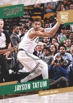
'17-18:
What a strange journey Playoff's Prestige has taken, but while by this point it was well on its way to being relegated to another base subset of Chronicles, I just think the angled design really works here. Obviously this says a lot about what I think makes photography work on a card.
'18-19:
I'm going to first give a nod to Chronicles here. After something of a rough draft the prior year, now they go all in on a) many brands and b) vibrant colors/parallels. I won't say the base design here is necessarily my favorite of the year, but it's excellent, and it's standard enough to let the more out-there subset designs stand out:

The base veteran design of the year was Donruss, which was just plain glorious in the way in wove in prior Donruss/Leaf designs to create something new which really worked across sport. (I will say I don't think the rookie design worked well for basketball, and it's worth noting they updated it for the 2019 WNBA set in a way I think improved things.)
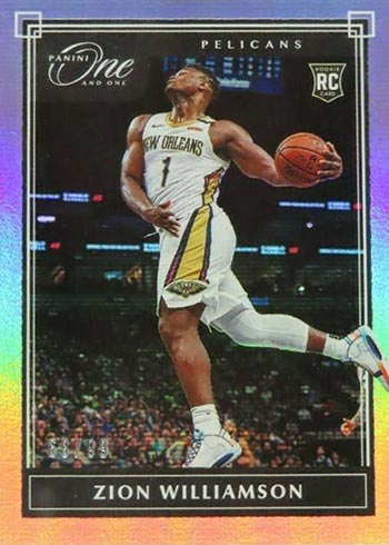
'19-20:
One and One really came in and hit a home run. As is typically the case for me, the choice of photography to use with the base design loomed large, but I don't think a more complicated design would have made this look any more majestic.
'20-21:
So, a set that to me seems like it's always been an afterthought to the hobby really stood out here: Panini Black. Technically the rookie designs deviated from the veteran design - and I'm showing the rookie design because I particularly love it - but I think the whole thing just really works, and it's a good example of how subtle changes from the previous release can make a big difference:

'21-22:
Probably the most impressive of all the Court Kings set designs for me. Veteran base is just about perfect given the brand's use of illustration and team color:

And I'll shout out the Rookie IV design that is probably my favorite design out of anything from Court Kings base in any year:
The debut of Photogenic deserve mention too. The design around the photos is secondary of course, but it's well-thought out and elegant:

I'm going to stop there because, to be perfectly honest, I can't say I'm blown away by anything in '22-23.